


The Bitcoin Rainbow Chart has grown to be a well-liked visual resource among cryptocurrency investors and traders looking for information about the price changes of Bitcoin. This graph offers a distinctive viewpoint on market cycles and possible price trends by plotting Bitcoin’s historical price performance against a color spectrum.
Bitcoin Rainbow Chart: What does it mean?
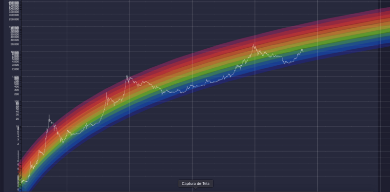
Based on its logarithmic development curve, the Bitcoin Rainbow Chart is a visual depiction that gives different colors to different price levels. Investors can see potential levels of support and resistance as well as different market cycle stages. Seven different hue zones can be seen on the chart, ranging from deep red (which indicates that Bitcoin is overbought) to deep violet (which indicates that Bitcoin is oversold).
Understanding market cycles
- Accumulation Phase (Green and Light Blue): Consolidation and a time of low activity are represented by this phase. The relatively constant price of Bitcoin presents a chance to stock up before the next bull run.
- Bull Market (Yellow to Deep Red): As Bitcoin’s price moves into this stage, it begins to pick up speed and appreciate significantly. As the bull market continues, the color’s intensity deepens, suggesting more extreme overbought situations.
-
Bear Market (Deep Red to Deep Violet): After the bull market’s top, Bitcoin moves into a bear market. The chart shifts from deep red to deep violet, signifying oversold conditions, as the price steadily drops.
Bitcoin Rainbow Chart’s drawbacks
Even while the Bitcoin Rainbow Chart is a helpful visual aid, it’s crucial to recognize its limits. It is mostly based on past data and cannot predict how prices will change in the future. To make knowledgeable investment decisions, it should be utilized in combination with other technical and fundamental analytical techniques.
Final thoughts
Investors and traders can view the price cycles of Bitcoin in a distinctive way with the help of the Bitcoin Rainbow Chart. People may make better decisions in the volatile Bitcoin market by recognizing market bottoms and highs and visualizing support and resistance levels. But it’s crucial to approach the chart as one tool among many and take into account a thorough examination of market movements and other elements influencing Bitcoin’s price.


